Colour and Branding
Do you know why Coca-Cola’s logo is red not blue? Why Starbucks uses green for their logo rather than purple? The colour of a brand is often the strongest visual element that pops and creates a specific mood, impression, and representation of the brand. Let’s look at some of the most common branding colours that highlight the positioning of products or services and what I think about the colours in terms of branding.
Red
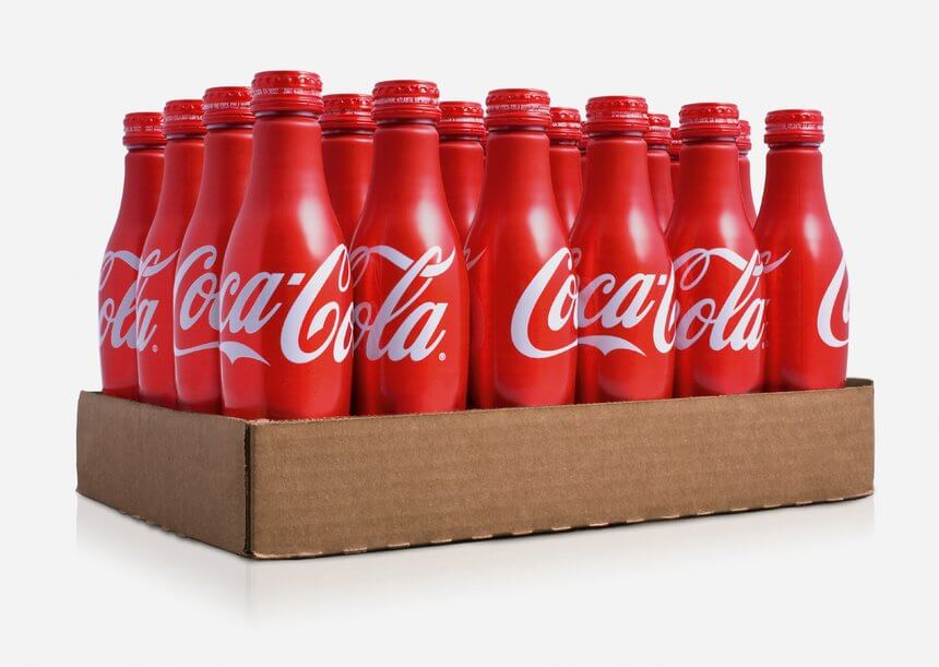
Photo: D&AD
Although red stands out very well among other colours, it is so bold (and sometimes dangerous) that it may not truly reflect the value of the brand. Yet, the look and feel of the brand could be changed entirely by adjusting the shade of red or adding a secondary colour to the logo.
Orange
Orange brings happiness, creativity, freedom, and success. It is not as aggressive as red but it is also a warm colour. Orange stimulates our appetite which is why food products and restaurants use orange a lot. Hermes, Home Depot, Easy Jet pick orange as their primary branding colour which shows how joyful and creative their brands are.
Photo: Littleone
In my opinion, choosing orange for a brand could be very tricky. If orange applies to an inappropriate font or design, it would completely destroy the brand by downgrading it and making it look cheap and immature.
Green
Green is often associated with nature and environment. It generates peace of mind and it is easy on the eyes. Brands such as Sprite, Land Rover, Heineken, 7UP, Starbucks, Whole Foods, TD Canada Trust, Holiday Inn use green in their logos for specific purposes. It is also a typical colour for environmental advocate groups.
Photo: Notable Life
Personally I think light or pastel green is fun to play with but dark green could be elegant but dull and conservative depending on how it is mixed and matched with other colours, shades, and font.
Blue
Blue is probably the most common colour in logo design. It is everywhere from the tech industry to financial institutions. Companies like Dell, Facebook, HP, BMW, American Express, Samsung, Twitter, LinkedIn, Skype, WordPress are in blue. It stands for trust, calmness, professionalism, and stability.

Photo: Entrepreneur
I strongly believe that it is the most traditional and cliche colour for logos. I mean, if you can’t think of what colour suits your brand, go with blue! 99% chance it works and looks official (but boring).
Purple
Mysterious! Creative! Luxurious! And sometimes, chocolate! These are the words that come to my mind whenever I see purple. Purple creates a classy, creative, powerful, and ambitious mood to the overall design.
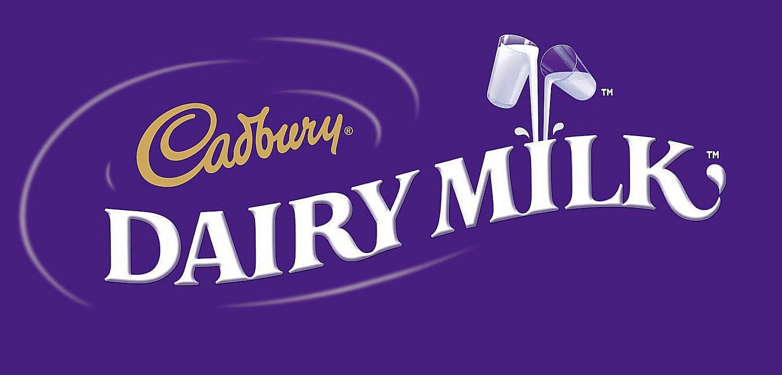
Photo: Logopedia
Cultural Differences
When choosing the right branding colour for your brand, one thing to bear in mind which is often overlooked is the cultural differences and geographic location of where your products or services are available. Because of globalization and advanced online technology, we are now able to purchase almost any goods in the world online. For some cultures, certain colours should be avoided for specific products or services. Intensive research is needed prior to making the right decision for your brand.
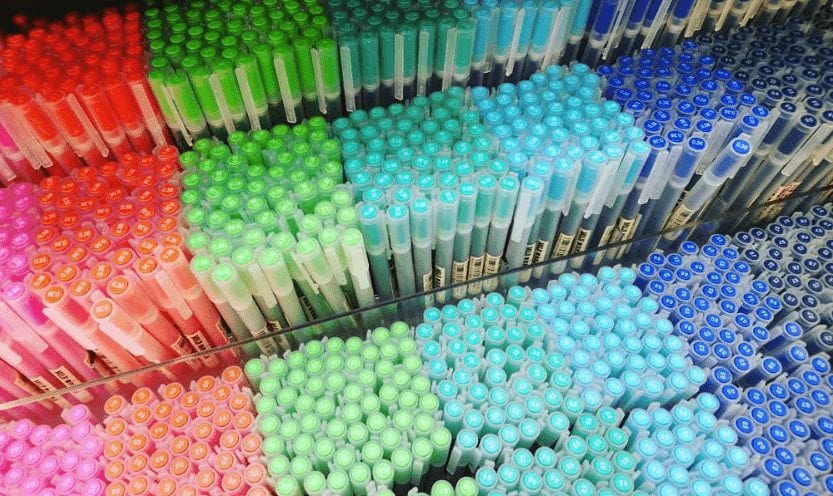
Photo: HennDesignStudio
Let’s work together! Contact us at 778-379-2177.


![How To Create A Brand Identity[Header]](https://www.y5creative.com/wp-content/uploads/2019/09/How-To-Create-A-Brand-IdentityHeader-150x150.jpg)
